Navigator
Equipping United Airlines call center agents to handle customer service requests efficiently and effectively.

DURATION
August 2020 - Ongoing
PROJECT TYPE
Web Application
TEAM
1x Design Lead
1x UX Designer
1x UX Researcher
2x Product Owners
1x Lead Developer
Subject Matter Experts
TOOLS USED
Sketch
Axure
InVision
Abstract
KEY ACTIVITIES
Task Analysis
User Surveys
Remote User Interviews
Wireframing & Prototyping
Concept Testing
Usability Testing
The Problem
United Airlines has around 5,000 call center agents stationed across various countries around the globe relying on two disparate applications to handle customer service requests: EZR (native desktop app) and Compass (web app). Maintaining both applications has become unsustainable. Compass has reliability and performance issues. EZR is difficult to learn. United is in need of a replacement.
The first iteration of a replacement application, named Navigator, was already completed by a 3rd party consulting firm by the time my work began. Design decisions were made that rendered the UX architecture inextensible. Features or workflows not addressed in this iteration could not be successfully integrated later on.
My Role
As the UX Designer, I collaborated with a Design Lead as well as Product Owners, Developers and SMEs.
My primary contributions were:
Analyzed the current ecosystem of applications.
Conducted stakeholder interviews.
Co-planned and synthesized research.
Ideated and prototyped concepts.
Information architecture and interaction design.
Our Challenge
Once COVID-19 hit, United was forced to shut down development on all non-critical projects and went into MVP on remaining projects. With limited resources and no budget to restart Navigator, our team was tasked with redesigning the existing Navigator architecture. Initial requirements involved incorporating a key set of features from Compass to deliver an MVP of the flight shopping experience.
United’s goal was to eventually sunset Compass and EZR in addition to providing the following:
Better accommodate the agent's workflow.
Provide a single source of truth for all agents.
Reduce call handle times.
Enable faster adoption and reduced training costs.
Our goal was to design a solid product foundation to accommodate the numerous features planned which would in turn enable United to accomplish their goals. However, severe tech constraints limited our ability to implement new design patterns and multi-page flows.
Our Solution
An easy to learn interface with a flexible architecture that supports the call center agent’s unpredictable call flow. This solution will improve the overall usability and efficiency of Navigator by allowing agents to navigate freely between tasks, allow for simple error resolution and handle complex scenarios.
THE APPROACH
How we got there
The process of getting to our solution occurred over a multi-sprint workflow. We collaborated with stakeholders, users and engineering to balance our user needs with business goals while also working within strict tech and operational constraints.
Understanding the legacy applications
As a first step, we took a deep dive look at Compass. The application is a web-based interface that provides agents with an experience similar to that of United.com. EZR was also analyzed, but due to United wanting to sunset Compass first, EZR wasn’t our primary focus. With the help of our Subject Matter Experts, we created a process flow diagram to give us a complete picture of the current architecture in Compass.
From here we started to form some initial assumptions as to what are the main problems with Compass:
The application is extremely slow, which could result in calls taking much longer than needed.
Having to modify any part of a booking during a call would cause the flow to start over which could be a frustrating experience for both agents and customers.
Errors occur frequently with unclear messaging which could be difficult to parse during a call.
Current state Compass (flight search results)
Current state EZR

BUILDING EMPATHY
Discovery Research
A plan was formulated to test our assumptions, dig up pain points and gain a holistic perspective on the flight shopping experience. From there, we would begin to form design insights.
Online Surveys
A detailed survey was put together by me and my Design Lead. Our goal was to distribute this survey across all the main call centers around the globe which would:
Help validate pre-established pain points.
Test initial assumptions.
Help prioritize which pain points and features to fix.
Identify any design “quick wins”.
Establish baseline benchmarks for the current Compass experience.
We received a total of 218 responses from agents in Argentina, Brazil, Japan, Mexico, Philippines, Singapore and the United States.
Remote Usability Testing
Remote moderated usability testing was conducted with eight agents located in the United States, Mexico and Philippines. A research plan was put together by me and my Design Lead with help from our UX Researcher. Our primary goal was to gain an understanding of their current mental model by tasking them with completing a typical call flow in Compass.
Our UX Researcher had agents walk us through a variety of tasks at different points, ask about specific UI elements, specifically, whether they help or detract from their workflow and what types of workarounds they’d perform, if any.
Each participant would also be asked a series of questions regarding their overall experience using Compass.
Task Analysis
In addition to usability testing, I conducted a hierarchical task analysis to gain a better understanding of the tasks involved with booking flights in Compass. Analyzing these tasks an agent would perform gave us a better idea of how and why certain issues would arise. I was able to identify extraneous or repetitive tasks that could be mitigated.
Finally, we’d perform simulations, taking a deep dive look into each feature. By taking into account the information provided during our interviews as well as utilizing our own design expertise we were able to identify some key insights.

Comparing existing applications
The information we were able to gather during discovery helped us analyze the advantages and disadvantages of each of the existing applications from the perspective of our end users.
How might we combine the efficiency of EZR with the ease of use of Compass?
DESIGN INSIGHTS
What did we learn?
From the surveys, usability testing, stakeholder interviews, and task analysis we gained both qualitative and quantitative insights. All design decisions made after were guided by the insights gained during our discovery research.
All qualitative and quantitative data was compiled into a large affinity diagram. Again, Lucidchart’s collaboration features made it easy for me and my design lead to compile this data together.
INSIGHT ONE
Customers dictate the call flow
Rationale: Customers are calling because they need help from our agents. This typically means that the customer is calling the shots and the agents are there to facilitate their needs. In most cases, agents are required to jump back and forth between multiple tasks, which Compass doesn’t support, thus ruining their workflow.
INSIGHT TWO
Guardrails provide agents with confidence
Our agents felt that Compass provided them "guardrails" to keep them on the right path during a call. In contrast, they mentioned that EZR felt overwhelming, with unclear pathways which could lead them to making mistakes and increasing their call handle time.
INSIGHT THREE
Extraneous tasks slow down calls
Almost all agents mentioned customers would ask questions that required agents to dig through the interface to find an answer. Questions around things like baggage pricing, cabin comparisons, travel policies, etc. All of these required agents to open external links taking them out of the call flow.
INSIGHT FOUR
Errors and latency issues cause agents to abandon Compass
Given that Compass has many dedicated steps to complete a call, navigating between them can be extremely slow, often causing agents to lose their patience. This is further exacerbated by random errors. Agents expressed frustration that any time an error does occur, especially when they’re almost at the end of flow, it has the potential to ruin the entire call. This can ultimately lead to them starting over or moving to EZR instead.
INSIGHT FIVE
Customers want to compare booking options
Customers will ask to compare the cost of buying a ticket with money vs buying a ticket with their mileage points. Unfortunately, none of the current applications support this which requires the agent to restart a call flow from the beginning, resulting in frustrated agents and customers.
CONCEPT IDEATION
From insights to ideas
Our research findings were presented to stakeholders to build team empathy and bring attention to neglected issues agents have been facing for some time. I then proceeded to design multiple concepts to address the findings.
A couple of How Might We questions informed my concept design strategy:
How might we design a flexible flow that accommodates a non-linear call?
How might we speed up the call flow without affecting load times?
How might we enable agents to recover from any error at any point during the call flow?
How might we provide an intuitive “experience” for our agents?
Concept Testing: Round One
Sketching and lo-fi wireframes helped solidify the initial concepts which I would then create iterative prototypes of increasing fidelity with feedback from stakeholders. We landed on three concepts of varying architecture and flow.
We then proceeded to test our concepts through a series of remote, moderated tests with the follow goals in mind:
Identify which concepts would best accommodate an agent’s call flow - then incorporate them together for a “best of” version.
Use the “best of” version to establish an architecture that is most extensible to build a solid foundation for the rest of the application.


Concept Testing: Round Two
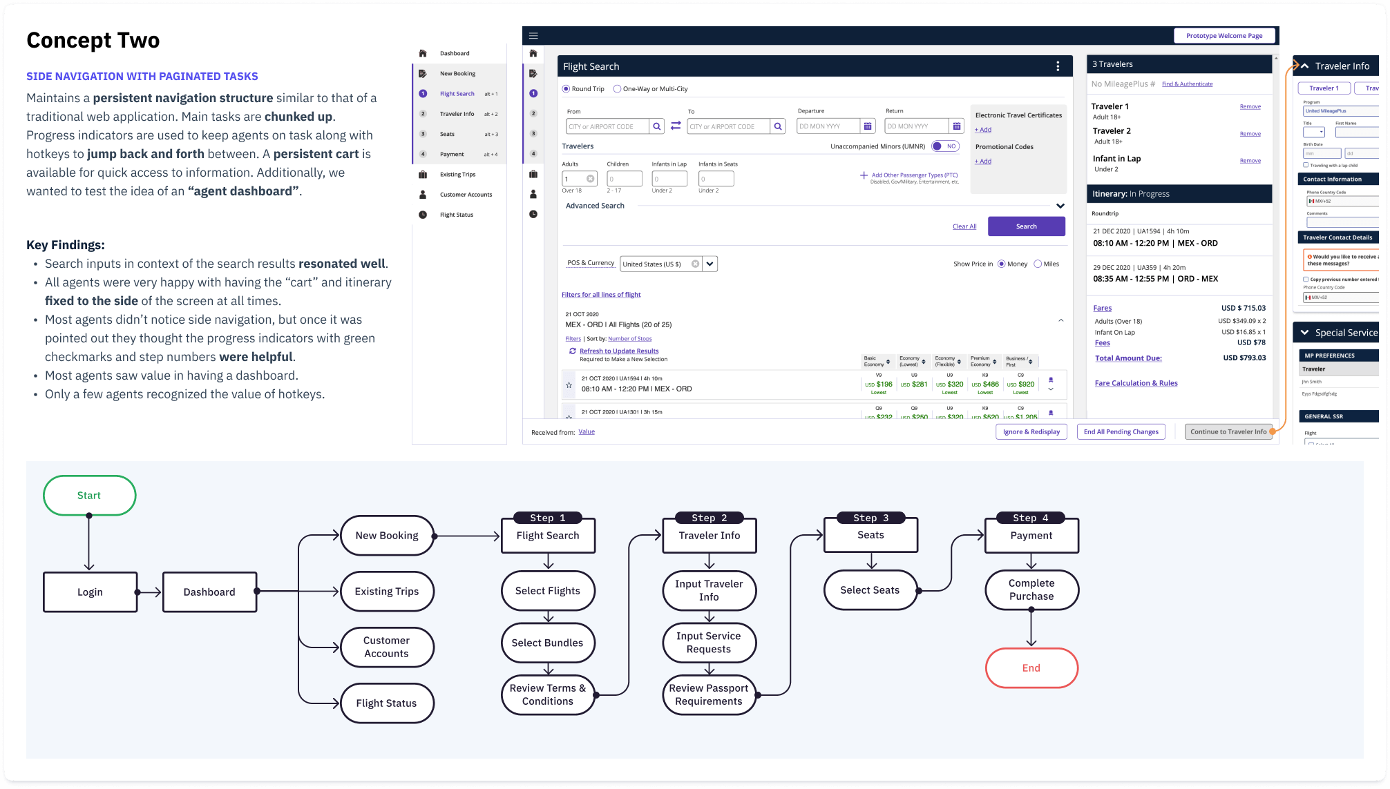
Feedback from round one of testing resulted in us eliminating Concept 3. I decided to modify Concept 1 and Concept 2 further. This time I wanted to directly compare having all the primary task cards on one page vs chunking each step.
Additionally, I wanted to further validate the progress indicators since it resonated well with agents.
Deciding on direction
Both concepts received equal amounts of praise. Here were some of the key findings:
Agents didn’t notice or pay any attention to the progress indicator “timeline” in Concept One, but all loved seeing the completion icon in the card header.
Some agents preferred to have their tasks chunked into steps to allow focus, while others preferred seeing all tasks at once.
Everyone agreed on having the itinerary fixed in view at all times was extremely useful, but most would prefer it be located on the right side of the screen.
Our decision on which architecture to proceed with would come down to two things:
Referring back to our key insights, specifically, “Customers dictate the call flow”, we concluded that having all the tasks available one page would give the agent the most flexibility to handle a call flow as they see fit.
Given our tech constraints, splitting the application up into multiple pages would not be possible.
We would proceed with having all tasks available on one page.
FEATURE DESIGN
Building the right thing
With our newly formed architecture and flow, it was time to get our hands dirty. Each of the main features from Compass needed to be translated over to Navigator. The features would be divvied between me and my design lead. This allowed us to take responsibility and ownership over each piece.
We would work in 2 week design sprints following the process below:
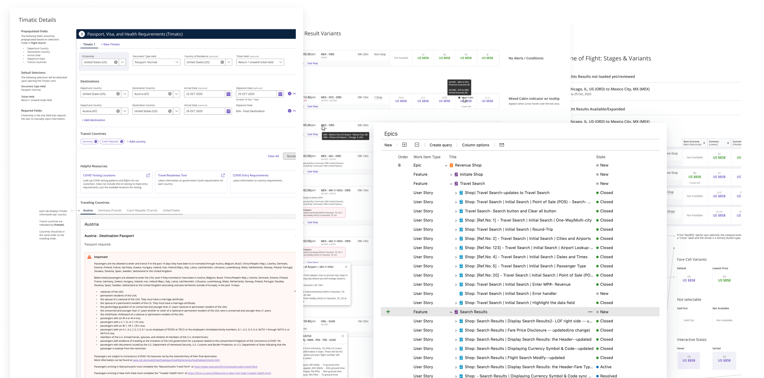
At the end of each sprint, after Product Owner and Subject Matter Expert approval, we’d deliver a set of high fidelity designs along with annotations detailing out flows, interaction specifications, error handling, design variations and additional use cases as needed.
We’d end up with 12 feature decks, all residing in InVision, for our development and product team to reference.
USABILITY TESTING
What do our agents think?
With the first set of features complete, we needed to validate them. I assisted my design lead in creating a massive prototype representative of our final designs in Axure.
We conducted a remote moderated task-based usability study with 11 participants spanning across multiple countries including, United States, Mexico, Philippines, Japan, Brazil and Argentina. At the end of each test, participants were asked to rate the overall experience 1 - 7 (1 = Very Easy; 7 = Very Difficult). Many agents compared the prototype directly against Compass.
With an average weighted score of 2, most agents found the overall experience easy. We did have one outlier who was resistant to change and would prefer EZR over any other application.
Key Findings:
No major usability issues - everyone was able to get through the flow.
Carrying over the data between the steps and jumping around as needed was the most important factor in the overall experience ratings.
Automatically moving the panels along and the proximity of cards to each other was a significant positive feedback on the usability.
Accelerators such as tabbing through and automatically preselecting options if only one exists helped.
Animations played a significant part in progressing the user through the flow and the usability of the application.
Green check marks throughout the flow to indicate a positive confirmation was a big success.
“Feels much better using this than EZR and Compass. We need this layout that gives us an easy flow.”
“Much easier and intuitive than Compass.”
Design Adjustments and Considerations


FINAL DESIGNS
Key Solutions
Flexible Architecture
The application affords agents the ability to handle tasks in any order they see fit. If a customer wants to compare booking a flight with money vs mileage points or reselect flights even after the agent has reached the end of the call flow, the application will support these scenarios quickly and efficiently.
Contextualized information
Information that was previously disjointed has been placed in context of the task at hand.
For example, selecting Bundles was previously done as a separate step in the call flow, but agents weren’t able to properly inform customers why these bundles were good deals because they were not in context of the selected flights.
Now Bundles are located in the same context of the selected flights giving them a greater chance of being understood and sold.
Reducing Complexity (and extra steps)
Following Tesler’s law, we identified as many places as possible where we could shift complexity from the user to the application.
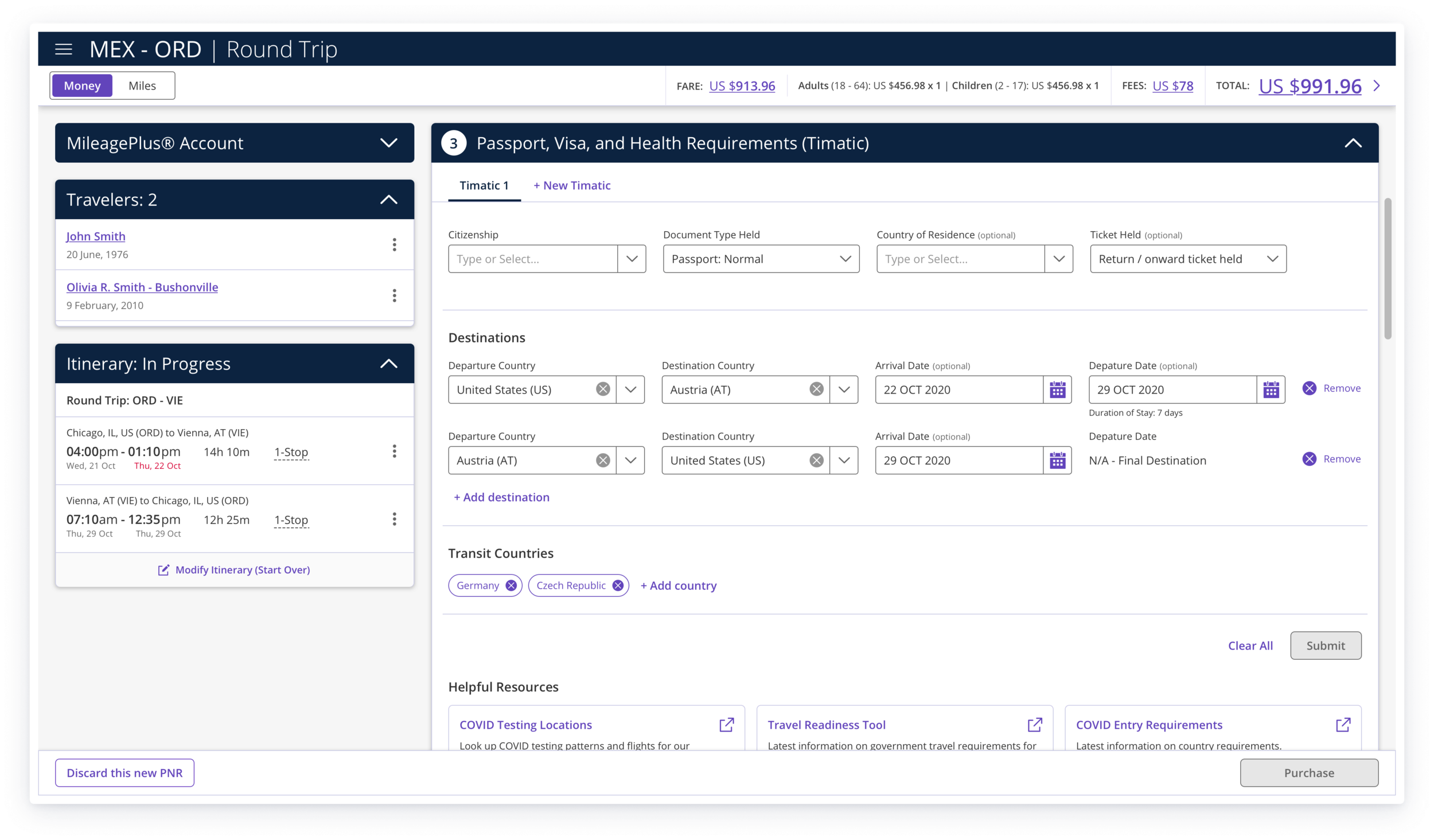
For example, In passport requirements, users needed to manually input information into many fields to request the travel requirements, but now the application will read the itinerary and pre-fill as much information as possible.
Providing Guardrails
We designed a hierarchy of system feedback to provide agents with the right information at the right time in the right place. Now agents will know exactly how to recover from any scenario regardless of complexity.
CONCLUSION
What’s next?
Incorporate the remaining Compass features which includes booking flights with mileage points and upgrading tickets.
Eventually incorporate all of EZR’s features. This will require a more thorough evaluation of EZR and its role in the call center ecosystem.
Hotkeys and accelerators: initial work of creating a hotkey system was started. I begun to evaluate EZR's hotkeys and any overlap with popular web browsers (like Chrome) in addition to Windows. Unfortunately this was descoped.
Further refine Navigator’s visual design for improved visual hierarchy and clarity.
Sunset EZR and Compass which will allow Navigator to be the single source of truth for all United agents.
What did I learn?
Spend more time understanding the context in which a user interacts with a product.
While it seems obvious now, truly understanding how difficult it is for an agent to have to listen, act, and respond to a customer all while interacting with these applications reframed how I approached designing for the agent. In this case, providing the most flexibility possible.
Don't rely solely on the SMEs for feedback and include real users as much as possible.
When designing each feature during our sprints, SMEs were the primary source of feedback as we didn’t have immediate access to users. It became clear that our SMEs had a different mental model than active agents, as none of them were taking calls. Ultimately, SMEs would give feedback based on what they personally wanted and not what our agents needed.
Build better relationships with developers.
Developers were not open to making larger adjustments when our designs called for it. In a few instances, when we did engage with our developers early and often they'd be more receptive to our ideas.
Speak with a wider user demographic.
Unfortunately, our international agents had poor representation. International agents would handle customers with different expectations and needs. We learned much later on that international representation would have greatly benefited our design process, especially during our design sprints, when design decisions needed to be made quickly.
Don’t design features up front without proper architecture.
Considering the large number of issues Navigator was facing due to the limited UX architecture, this shouldn’t be a surprise, but really understanding the needs of our users and all the use cases allows us to design a product that is scalable while also supporting the user’s workflow.
Closing Thoughts
This was a challenging project for me as the sheer amount of moving parts made it difficult to pin down a solid direction. We touched on just a piece of the overall call center process. I’m thrilled we were able to accomplish our primary goal of designing a more efficient and usable application that brings us one step closer to improving the lives of our agents around the globe. The new architecture will serve as a baseline for all features to be added later as we move closer to sunsetting Compass and eventually incorporating all features from EZR as well. 🌇 👋


